
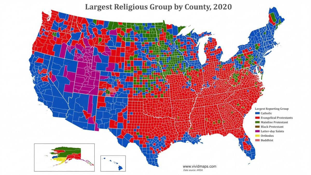
@savageupdatesA 2020 dataset identifies the largest religious group within each U.S. county. #UnitedStates
查看原帖@savageupdatesA 2020 dataset identifies the largest religious group within each U.S. county. #UnitedStates
查看原帖@savageupdates 的照片· Sep 1, 2026· United States
The image is a map of the United States showing the largest religious group by county in 2020. The map uses different colors to represent various religious affiliations, with a legend indicating that blue signifies Catholic, red signifies Evangelical Protestants, green signifies Mainline Protestant, brown signifies Black Protestant, purple signifies Latter-day Saints, yellow signifies Orthodox, and pink signifies Buddhist. The map has a clean, data-driven aesthetic. Visually notable is the stark contrast between the predominantly red (Evangelical Protestant) Southeast and the blue (Catholic) Northeast and Southwest. The map includes the website "www.vividmaps.com" and "Data source: ARDA" at the bottom.
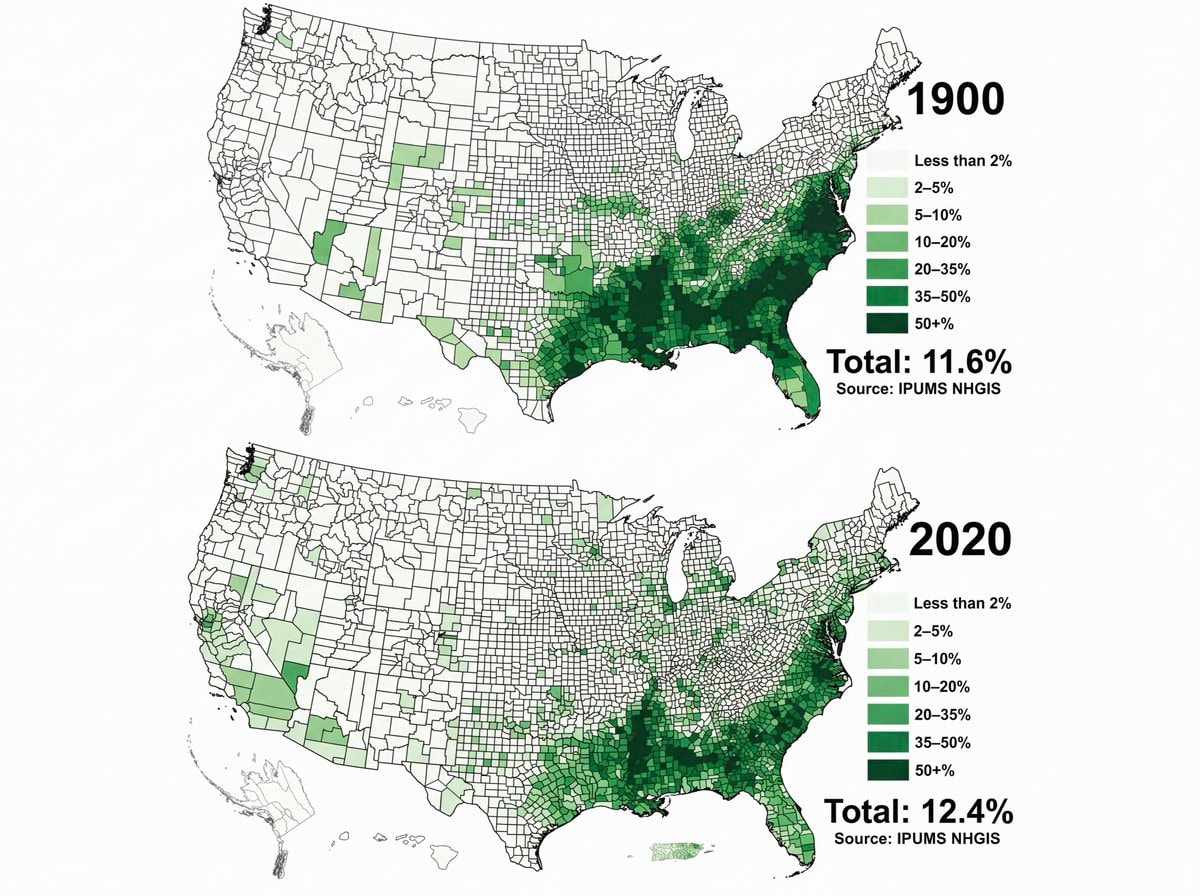 Black Population US 1900 vs 2020
 Trump AI Force emblem
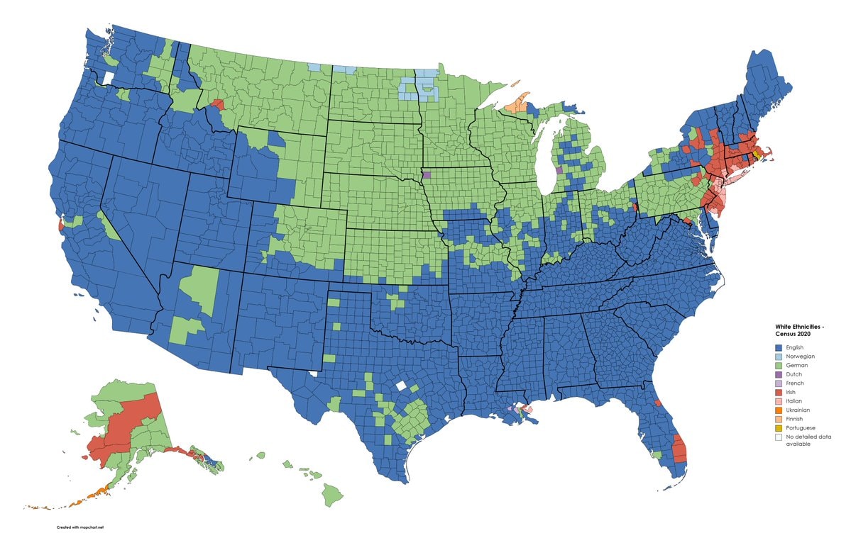 white ethnic groups by U.S. county
 2Trump serious expression
 Trump announces AI Force
 2Trump on midterm election outcomes
 Donald Trump Greenland Deal
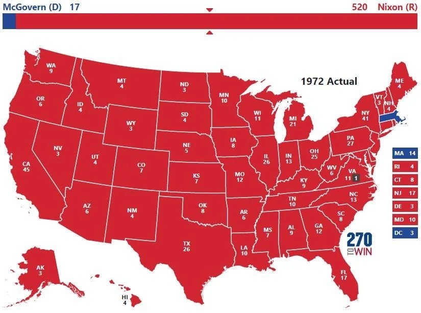 1972 US presidential election map
 2Toys R Us store expansion
 2US Republicans foreign piracy site ban bill
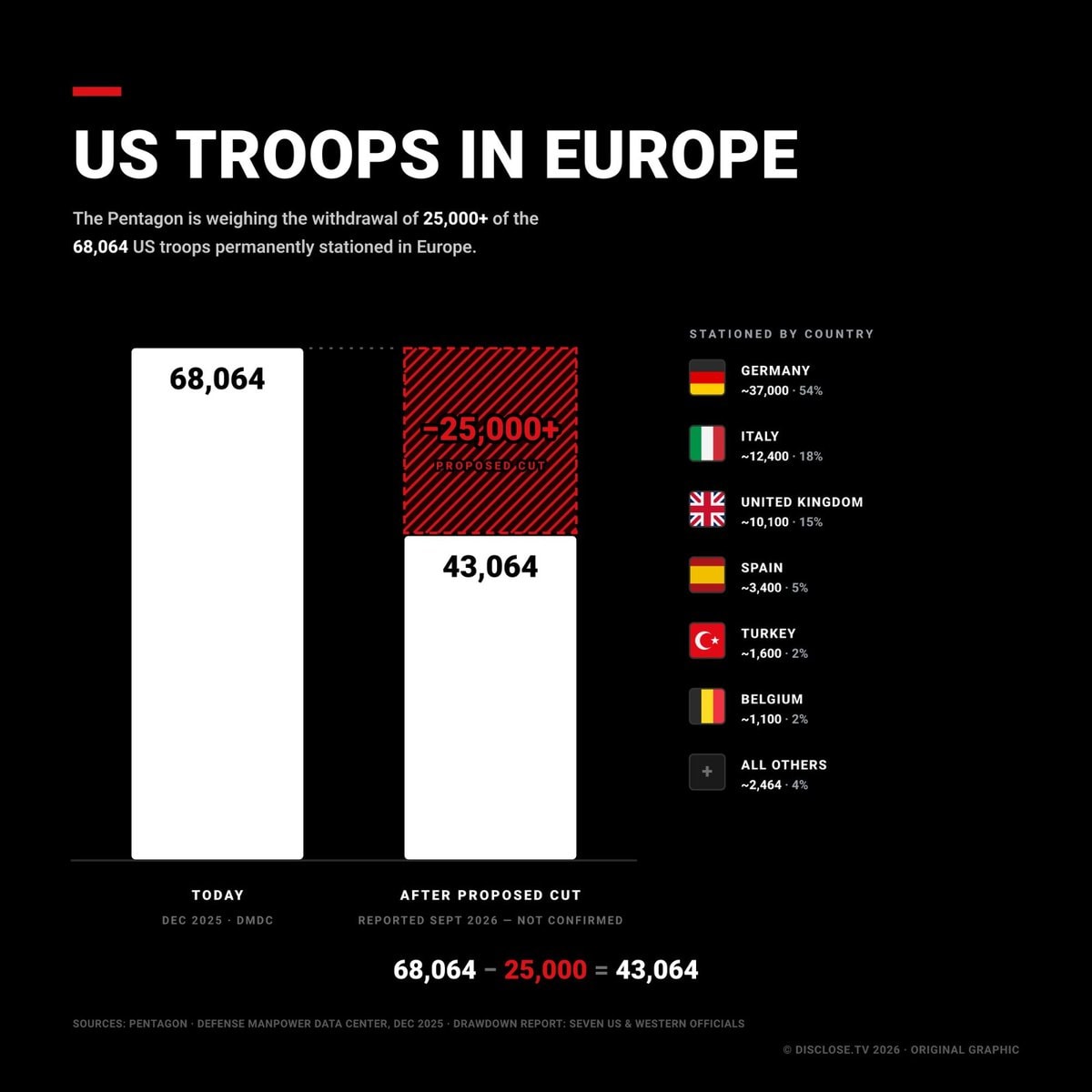 2US Troops in Europe proposed cuts
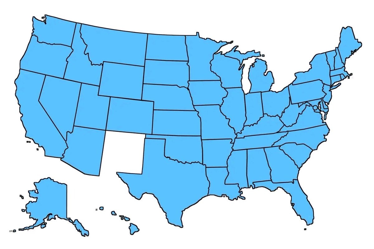 United States old states map
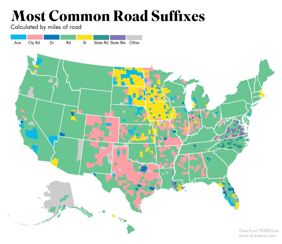 most common US road suffixes by county
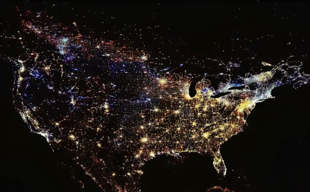 United States at night
 2China US outer space legal gap
 Brazil U20 Women's World Cup Quarterfinals
 Crypto Clarity Act Senate vote
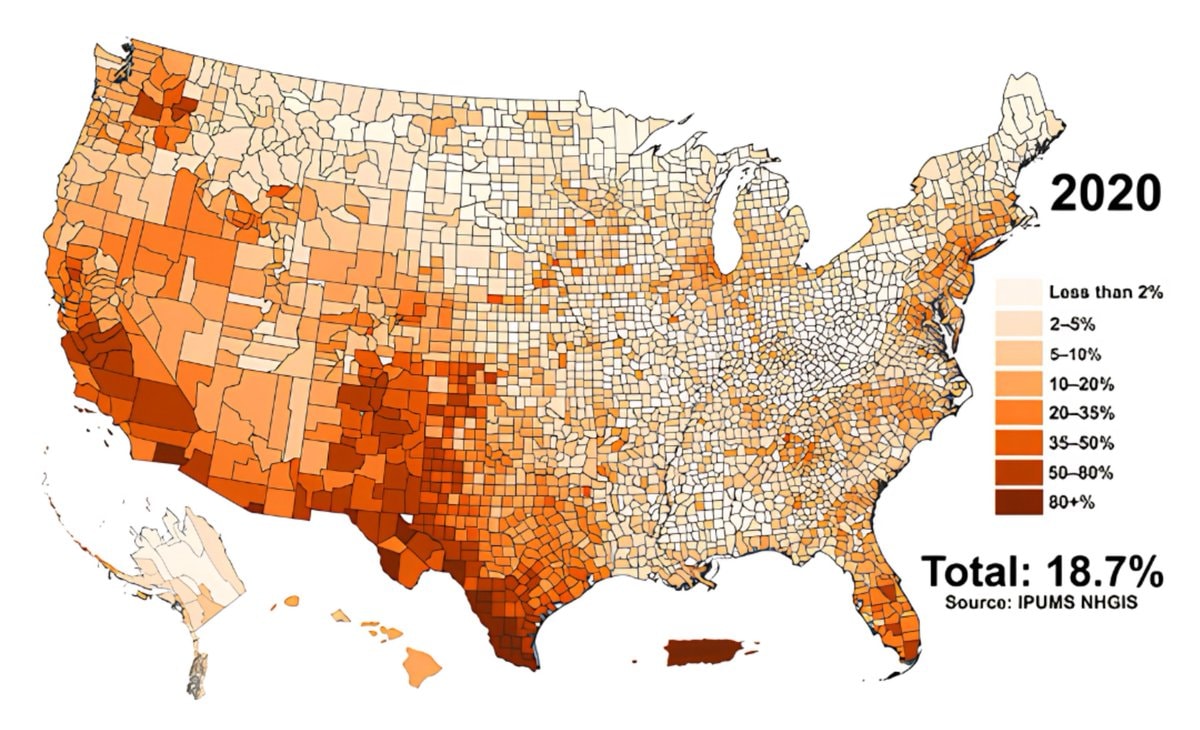 Hispanic population share by U.S. county
@savageupdatesA 2020 dataset identifies the largest religious group within each U.S. county. #UnitedStates
查看原帖@savageupdates 的照片· Sep 1, 2026· United States
The image is a map of the United States showing the largest religious group by county in 2020. The map uses different colors to represent various religious affiliations, with a legend indicating that blue signifies Catholic, red signifies Evangelical Protestants, green signifies Mainline Protestant, brown signifies Black Protestant, purple signifies Latter-day Saints, yellow signifies Orthodox, and pink signifies Buddhist. The map has a clean, data-driven aesthetic. Visually notable is the stark contrast between the predominantly red (Evangelical Protestant) Southeast and the blue (Catholic) Northeast and Southwest. The map includes the website "www.vividmaps.com" and "Data source: ARDA" at the bottom.
还没有评论。来抢沙发吧!
Black Population US 1900 vs 2020Trump AI Force emblemwhite ethnic groups by U.S. county2Trump serious expressionTrump announces AI Force2Trump on midterm election outcomesDonald Trump Greenland Deal1972 US presidential election map2Toys R Us store expansion2US Republicans foreign piracy site ban bill2US Troops in Europe proposed cutsUnited States old states mapmost common US road suffixes by countyUnited States at night2China US outer space legal gapBrazil U20 Women's World Cup QuarterfinalsCrypto Clarity Act Senate voteHispanic population share by U.S. county
还没有评论。来抢沙发吧!